
Web Design for Plumbers That Gets the Emergency Call
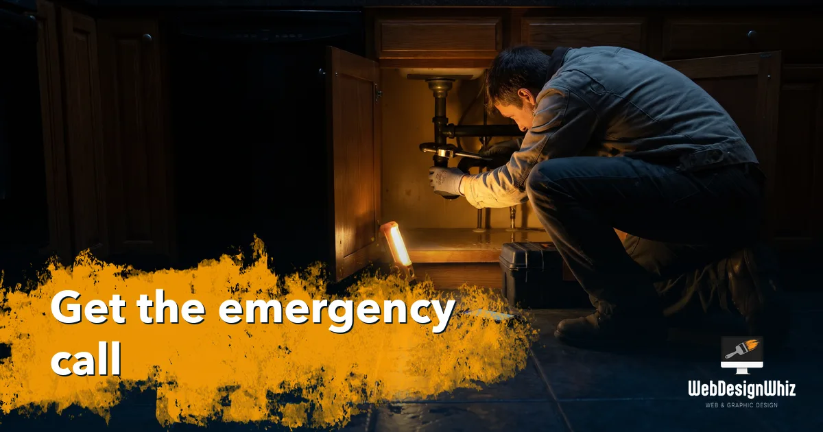
It is a Sunday night and someone has water coming through a kitchen ceiling. They are standing in it with a phone in one hand, and they will call one of the first three plumbers they can get a number from. They are not reading your about page. They want a number that dials on the first tap. If your site makes them work for it, they call the next plumber, and you never know the job existed.
Here is what a plumber’s website has to do, and how we build one that does it.
Key takeaways
- The customer who needs you most is in a hurry, on a phone, standing in water.
- A number that dials on one tap belongs in the first screen, not the footer.
- A price range for a common job beats “free estimates” every time.
- Your reviews are your license to enter someone’s home. Put them where they get read.
- A page for each service and each town is how you show up for a plumber search.
- You know the price before we start, revisions are unlimited, and you work with Zach directly.
1. The emergency search is a different customer
Most website advice is written for shoppers who browse, compare and think it over. Plumbing has those customers too, for a water heater or a remodel. The ones who pay the bills this week are not shopping. They want three answers in five seconds. Can you come, can you come now, can I call you right now. A site built for that person also works for the shopper. A site built for the shopper loses the emergency every time.
2. What the first screen has to say
Before anyone scrolls, your site should answer four things:
- What you do. Drains, water heaters, leaks, repipes, sewer lines, remodels. The words your customer types, not “full-service plumbing”.
- Where you work. The towns you cover. A customer twenty minutes outside your area wastes both your time.
- When you answer. Same-day, after hours, weekends, or business hours only. Saying “business hours only” beats a phone nobody picks up.
- How to reach you. A number that dials on a tap, and a short form for what can wait.
Most plumber sites bury all four under a stock photo of a wrench. Moving them up is the biggest single change we make.
Tell us what your first screen says today and we will tell you what we would change: send us a message.
3. Make the call easy to make
On a phone, your number should be big, near the top, and a real tap-to-dial link. Not an image, not text someone has to copy. We test it on a real phone, because this is the one thing on a plumber’s site that must never break.
Then catch the people who will not call. A short form, four or five fields, for the dripping tap and the water heater quote. Name, phone, town, what is wrong, and a place to attach a photo. A photo of the problem under the sink saves you a trip and tells you what to put on the truck.
Submissions should land in the inbox you actually read, and the customer should see a thank you on screen. We check both before launch.
4. Say something honest about price
Nobody likes a plumber’s invoice surprising them, and “free estimates” tells a customer nothing. The sites that win give a range: what a drain clear usually runs, what a water heater swap runs, and whether the call-out fee comes off the job. That feels risky. It does two things for you: it builds trust before the phone rings, and it filters out the people who were only going to ask the price and hang up. An “every house is different” line keeps every range honest, and we write it that way.
Want a second opinion on what your site should say about price? Ask us for a quote.
5. Web design for plumber owner-operators working on their own
If it is you, your truck and your phone, your site has one job: make a stranger comfortable calling you instead of the franchise with the radio ad.
That is mostly proof, and you already have it. Your license number. How long you have been doing this. Your reviews, pulled onto the page rather than left on a profile nobody visits. A real photo of you, because a one-person plumbing business is the person.
Keep it small and fast. Five good pages that load in under three seconds beat twenty nobody finishes. And be straight about your limits: the hours you answer, the area you cover, the jobs you take. Saying no on the website saves you the drive.
6. Showing up when someone searches for a plumber nearby
When someone in your area searches “plumber near me” at 11pm, are you on the first screen? If not, a good-looking site is a wasted site.
“Plumber” on its own competes with every plumber in the state and with the national booking sites. The searches you can win are specific: the service plus the town. Emergency plumber in your city. Water heater replacement in the next town over. Those are pages, not luck, so we build one for each service and each town you cover.
The rest is housekeeping: a fast site, titles that read well in Google’s results, and your name, address and phone matching everywhere. Our SEO guide covers it in plain words.
7. Web design for plumbing companies with trucks and techs
Once you are dispatching other people, the site has three jobs, not one.
It brings in work, the same as before. It brings in techs, and in this trade that may be the harder hire: a careers page with the positions, the pay range, what the work is really like, and an application that works on a phone at a job site. And it brings in the steady money: plain pages for commercial accounts, property managers and maintenance plans. A property manager with forty units needs a different page than a homeowner with a clogged drain, so we build both and keep them apart.
If you want online booking, we will say honestly whether it suits your dispatch or just annoys your office.
8. How we work
We have been building websites since 2005, and WebDesignerWhiz has run as a studio since 2020. The trades side is familiar ground: we build the sites for home service businesses, from landscapers to handymen to junk removal crews, all selling what you sell: a stranger trusting you enough to let you in the door.
You get the price before we start, with no hidden fees, and revisions are unlimited. You work with Zach directly. We use AI tools in the build so it goes faster and costs you less, with every page checked by a person.
We are so glad we decided to work with Zach at WebDesignerWhiz. He provided personalized guidance and a creative design to get our existing business webpage revamped into a high-quality website that we are proud to share with our clients—highly recommended!
FAQ
It depends on how many services and towns you want pages for, and whether we start over or fix what you have. You get a fixed price before any work starts.
Usually a few weeks. The slowest part is almost always getting job photos and service details from you, and we tell you up front what we need.
We do. You talk us through the jobs you want more of, we draft the pages, and you approve every one before it goes live.
Often, yes. If the platform is one we can work with, fixing the first screen, the phone number and the form is cheaper than a rebuild. We will say honestly which you need.
Ready to catch the next emergency call?
Tell us what you fix, where you work, and what your site does for you now. We will tell you what we would change and what it would cost.
Send us a message and you will hear back from Zach.